Hello! I'm
Sarada Priya

I design clear journeys for government services.banks.residents.AI products.
From information architecture to the last component.
How I work
Four habits I bring to every project, whatever the size.
Stakeholder interviews, audits, competitive analysis and personas to pin down what the product actually needs.
Information architecture, journeys and user flows, so the hard decisions happen before the UI.
Wireframes to high fidelity, responsive layouts and reusable components that scale across pages.
Documentation, developer handoff and UX/UI QA, working closely with the build team.
Kind words
What I like most about Priya is her ability to wear multiple hats… If you are looking for a Product Designer, do yourself a favor and reach out to her.
She excels at understanding complex briefs and executing them with precision, consistently exceeding expectations.
She consistently brings fresh ideas to brainstorming sessions and delivers visually compelling work that exceeds expectations.
From print to product. Still a storyteller.

I started in graphic design and advertising, and grew from designer to junior art director leading a small team.
That work taught me to start with the message and the audience. I brought the same habit into UX, completed an MSc in User Experience Design at Birmingham City University, and now work as a UX Designer at Globant.
Most of my recent work sits on large platforms: resident services, government websites and banking. I work with product teams, stakeholders and developers, from audits and information architecture through to components, handoff and QA.
I use Claude, ChatGPT and Figma Make to speed up exploration, documentation and consistency checks. The design decisions stay with me.
Outside design, I dance, travel, photograph unplanned moments, and mentor designers who are just starting out.
Experience
Full resume →- Apr 2025 – NowGlobantUX Designer (Semi Senior Advance)Manchester
- 2023 – 2025UNIMADUX/UI DesignerBirmingham
- 2024Srinergy GlobalUX/UI Designer, freelanceRemote
- 2023Lumenore, NetlinkUX/UI DesignerIndia
- 2019 – 2022Ting Ad AgencyGraphic Designer → Junior Art DirectorIndia
- 2019RR DonnelleyGraphic DesignerIndia
- MSc User Experience Design · BCU
- PG Diploma, Advertising Design · ICAT
- BSc Visual Communication · SRM
- Research & personas
- Information architecture
- Flows & wireframes
- Design systems & components
- Inclusive design (WCAG)
- Figma, Miro, Maze
- Photoshop, Illustrator, InDesign
- HTML/CSS, VS Code
- Claude, ChatGPT, Figma Make
“Design creates culture. Culture shapes values. Values determine the future.”
Robert L. Peters, a line I keep coming back to.
Sarada Priya Sirani
UX / Product Designer with 5+ years in design and 3+ in UX/UI, across government, banking, residential services, SaaS and AI products.
Experience
- Apr 2025 – NowGlobantUX Designer (Semi Senior Advance)Manchester, UK
- Led UX research across finance, education, distribution and events projects with stakeholder interviews, competitive analysis, personas and user flows, improving clarity of requirements by 30%.
- Improved user interactions through iterative testing, gap analysis, IA and content refinement, turning complex journeys into clear, usable flows.
- Built reusable design-system components and prototypes, using AI-assisted workflows to improve cross-team alignment and reduce design-to-dev effort.
- Nov 2023 – Mar 2025UNIMADUX/UI DesignerBirmingham, UK
- Designed the end-to-end product for AI-powered web and mobile interfaces, improving user interaction by 30% and onboarding success rates.
- Created scalable design systems and UX frameworks that strengthened brand consistency and visual quality.
- Partnered with engineering on data-driven refinements, cutting redesign cycles by 25%.
- May 2024 – Nov 2024Srinergy GlobalUX/UI Designer, freelanceRemote · US
- Led qualitative and quantitative research (interviews, surveys, usability testing) for a SaaS finance platform, boosting client inquiries by 30%.
- Designed a user-centric website with interactive prototypes, using BI insights and A/B testing.
- Worked with product teams on complex business challenges using design thinking.
- Feb 2023 – Jul 2023Lumenore, NetlinkUX/UI DesignerTamil Nadu, India
- Designed and improved SaaS dashboards, improving scalability across multi-user environments.
- Collaborated with clients on intuitive internal dashboards, significantly increasing usability.
- Ran usability testing and iterative refinements, improving stakeholder understanding and effectiveness by 40%.
- Nov 2019 – Dec 2022Ting Ad AgencyGraphic Designer → Junior Art DirectorTamil Nadu, India
- Led a team of 4 designers, improving client satisfaction by 20% and overall design efficiency.
- Delivered high-quality designs with marketing teams under tight timelines.
- Handled brand campaigns including e-commerce, increasing brand visibility by 30%.
- Feb 2019 – Nov 2019RR DonnelleyGraphic DesignerTamil Nadu, India
- Created brand-consistent assets for KPMG across digital and print, improving customer engagement by 10%.
- Managed global print production to strict deadlines for international clients.
- Developed campaign assets, improving client satisfaction and project outcomes by 20%.
Projects
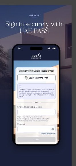
- GlobantDubai ResidentialWorked on lease renewal, e-agreement and UAE PASS flows, designed high-fidelity web and app screens, and ran UX QA with developers for a resident services platform on iOS, Android and web.
- GlobantInvest BankLed research, analysis, IA, team interviews and end-to-end design; wireframes and high-fidelity flows aligned with WCAG, with developer support through the build.
- UNIMADUnimad websiteDesigned Unibot, a conversational AI job-search experience at unimad.ai, increasing user engagement by 35%.
- ProductCrunch appA mindful-eating product for iOS and Android with a 90% usability success rate through focused research and iteration.
- MSc User Experience DesignBirmingham City University · 2023 – 2024
- PG Diploma, Advertising DesignICAT Design & Media College · 2018 – 2019
- BSc Visual CommunicationSRM Arts & Science College · 2015 – 2018
- DesignFigma, Miro, Maze, Photoshop, Illustrator, InDesign
- Build & dataHTML/CSS, VS Code, SPSS, Microsoft Office
- AIFigma Make, Claude, ChatGPT, AI-assisted UX workflows, prompt engineering
Need my CV as a file?
Dubai Residential
A resident app and portal for leases, payments and services. This case study follows its most rule-heavy journey: renewing a lease.
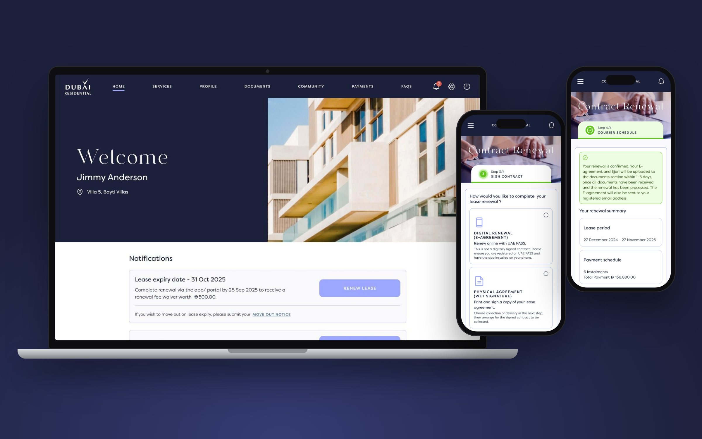
One task, many cases
Renewal changes with the contract: new or existing tenants, parking and storage, multi-unit and business accounts, digital or paper signing.
Flows to QA
I worked on renewal and e-agreement flows, UAE PASS steps, high-fidelity web and app screens, and UX QA with developers.
Flows, states, checks
- 4-step renewal flow
- Digital vs physical signing
- Courier collection & delivery
- Edge, error & system states
Approved journeys
Key journeys signed off by the client, with store-ready screens prepared for iOS, Android and tablets.
Eight services, one resident app
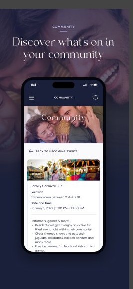
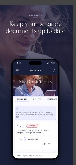
Renewal sits inside a wider product: payments, maintenance, amenities, community events, documents and secure sign-in with UAE PASS. I focused on renewal because it carries the most rules and the highest stakes for residents.
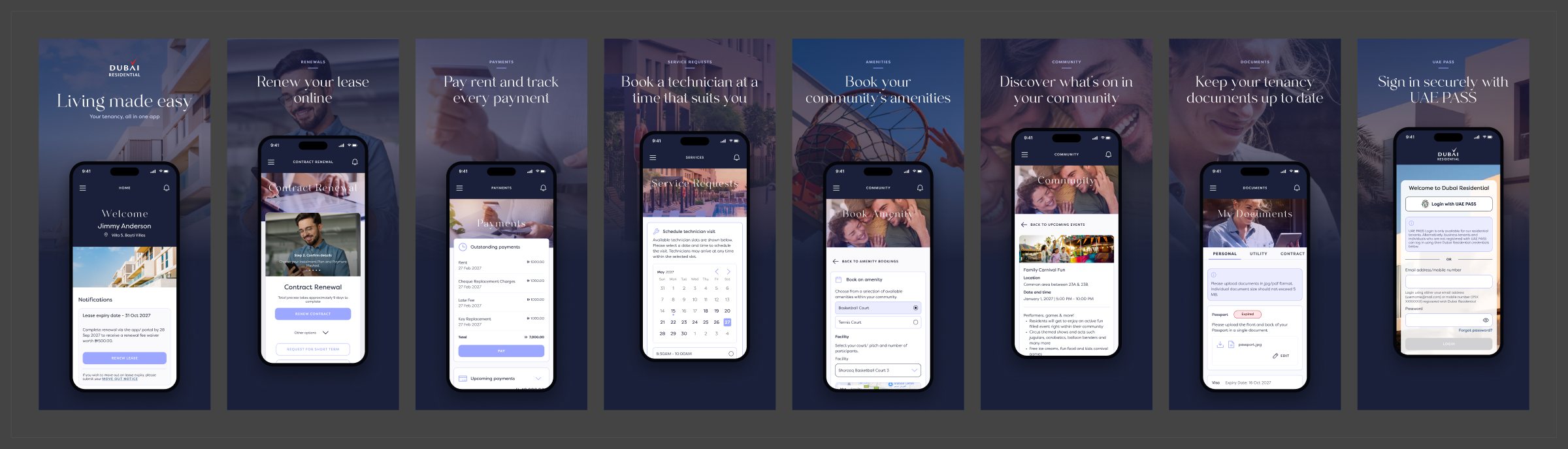 App store screens · tap any image to enlarge
Mapping every renewal scenario first
Before drawing screens, I worked through the requirements with the team to list who renews, what they renew and how they sign. This matrix became the checklist every design had to pass.
| Tenant type | New renewal | Existing renewal | Parking & storage | Digital signing (UAE PASS) | Physical signing |
|---|---|---|---|---|---|
| Individual tenant | Covered | Covered | Add-on | E-agreement | Collection or delivery |
| Multi-unit tenant | Per unit | Per unit | Add-on | E-agreement | Collection or delivery |
| Business tenant | Covered | Covered | Add-on | E-agreement | Extra company documents |
Where renewal starts
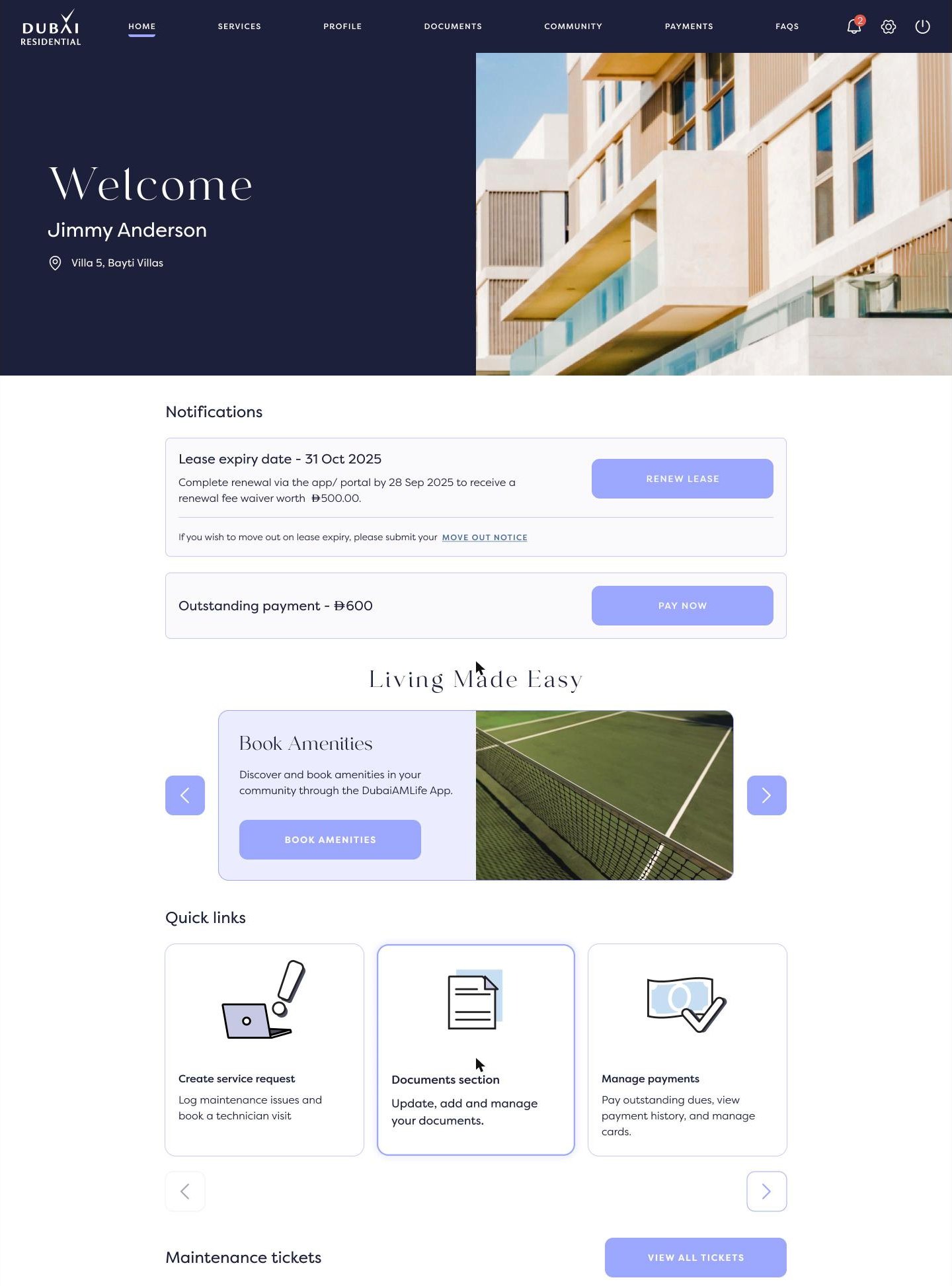
The homepage changes as a lease nears expiry, so the renewal prompt appears where residents already look.
Two payment paths
Residents either keep the same payment schedule or choose a new one, and each path needed its own review step.
Edge cases designed up front
One spine, two signing branches
Every tenant moves through the same four steps. The only real fork is how they sign, and the physical branch only asks what it needs to.
What shaped the design
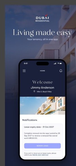
Start renewal where residents already look
Ninety days before expiry, the homepage leads with a notification: the expiry date, the deadline for the early-renewal fee waiver, and a Renew lease button. Move-out sits right below for anyone not renewing.
- No hunting through menus for a time-critical task
- Both outcomes, renew or leave, start from one card
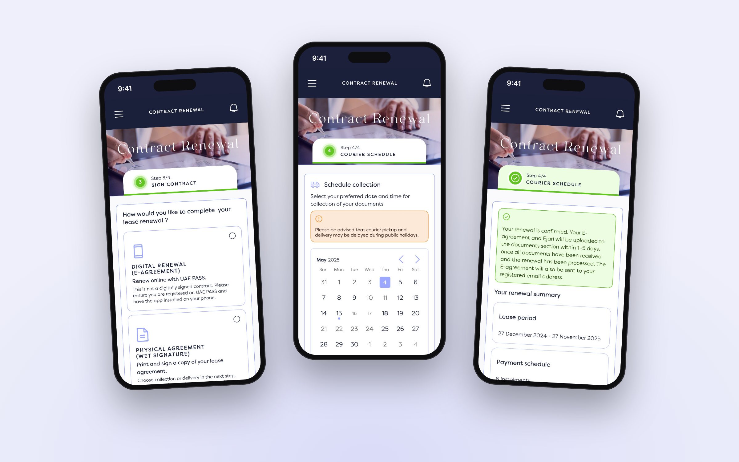
Four steps, always in view
On desktop the full stepper stays visible. On mobile it folds into a single "Step 3/4" card so the content keeps the screen.
- Residents always know what's done and what's next
- The same spine holds every tenancy variant
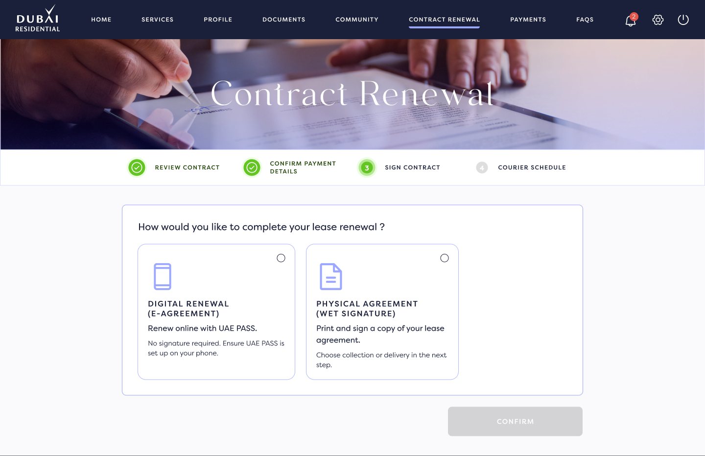
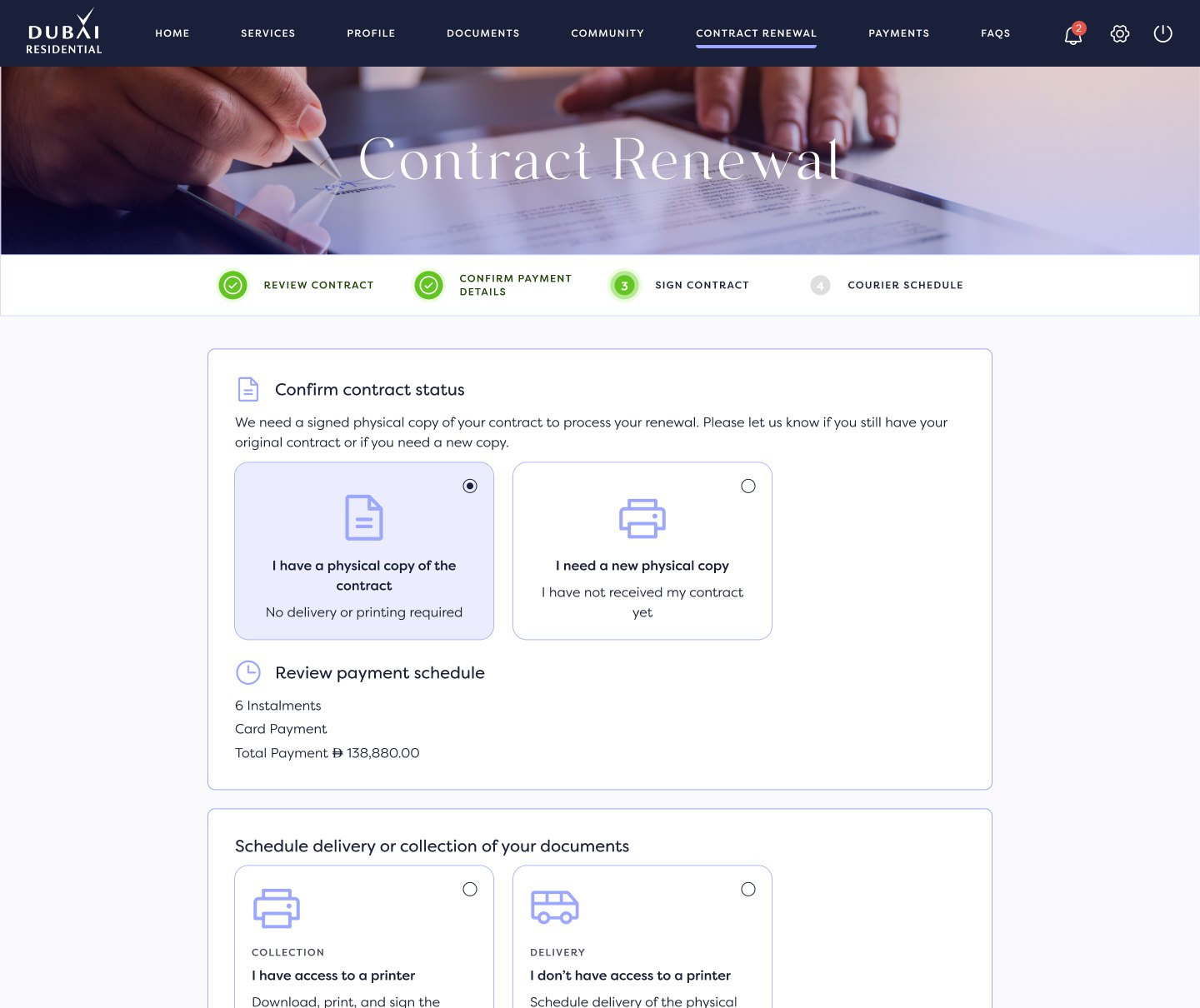
Two ways to sign, one journey
Residents choose a digital e-agreement through UAE PASS or a physical wet signature. The physical path asks two plain questions: do you already have a copy, and can you print at home?
- Digital path skips courier steps entirely
- Plain-language options instead of process terms
Close the loop before they leave
For paper contracts, residents pick a date and time slot, confirm a pre-filled address and see exactly which documents to have ready. The last screen sums up the lease period and payment schedule, and explains what happens next.
- Fewer failed pickups and follow-up calls
- A clear record of what was agreed
Renewal components
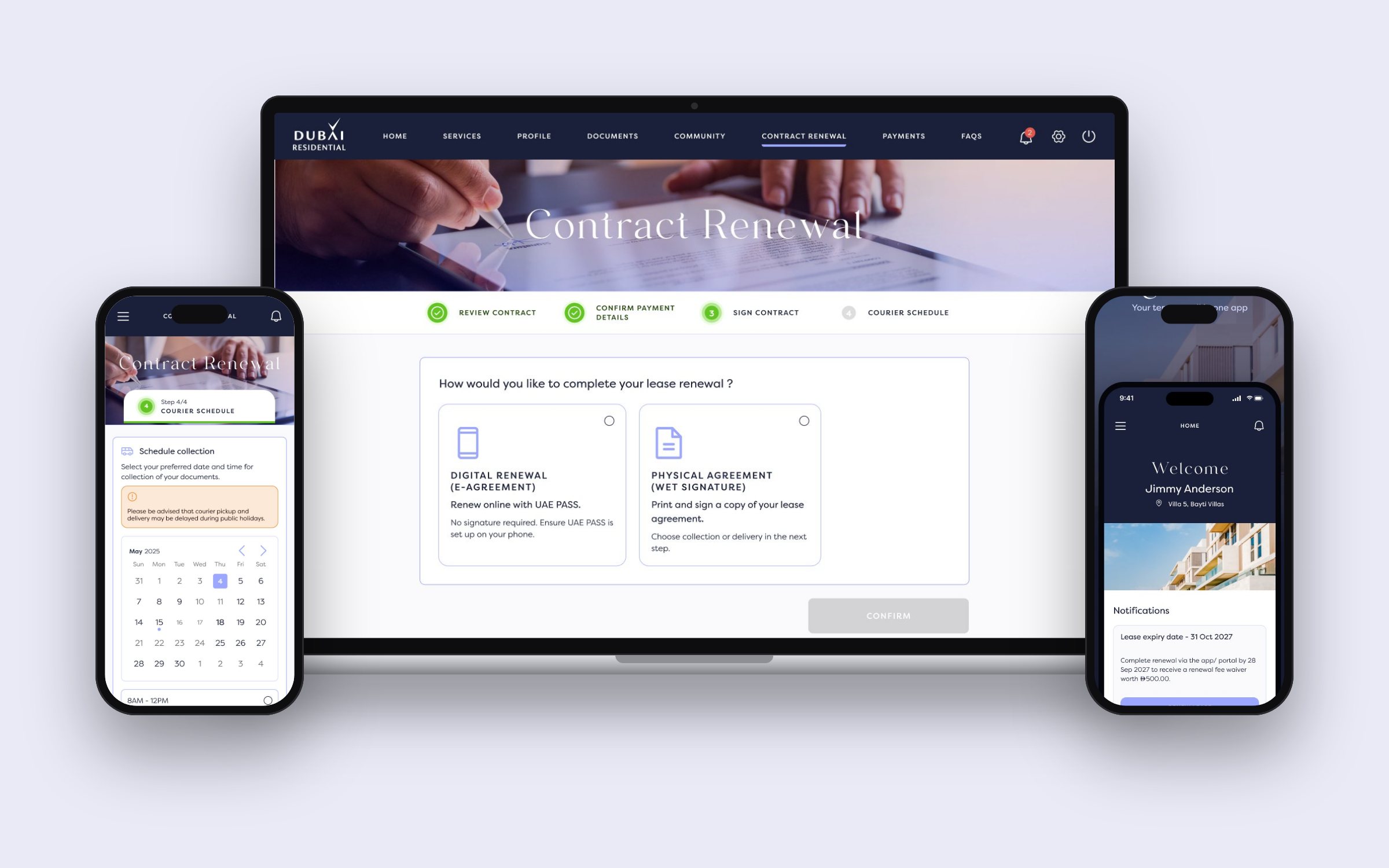
The renewal journey reuses a small set of components across web and app. I kept them consistent with the product's existing system and checked them against the build during QA.
Web, app and store
Delivered across responsive web and the iOS and Android apps, then packaged for the app stores.
How residents first meet the app
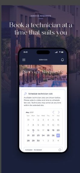
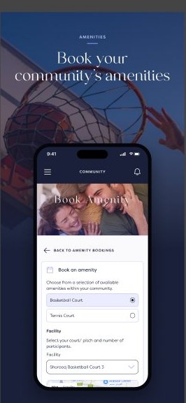
The store screens tell the product story in eight frames, one per service, with renewal second in line. They were prepared for iPhone, iPad and Android phone and tablet sizes.
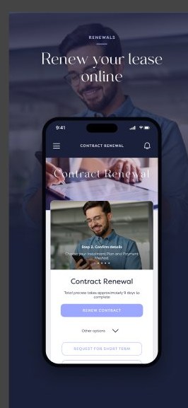
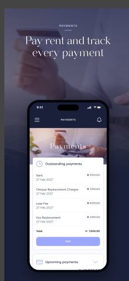
Renew your lease, pay rent and book a technician.
Emails that match the journey
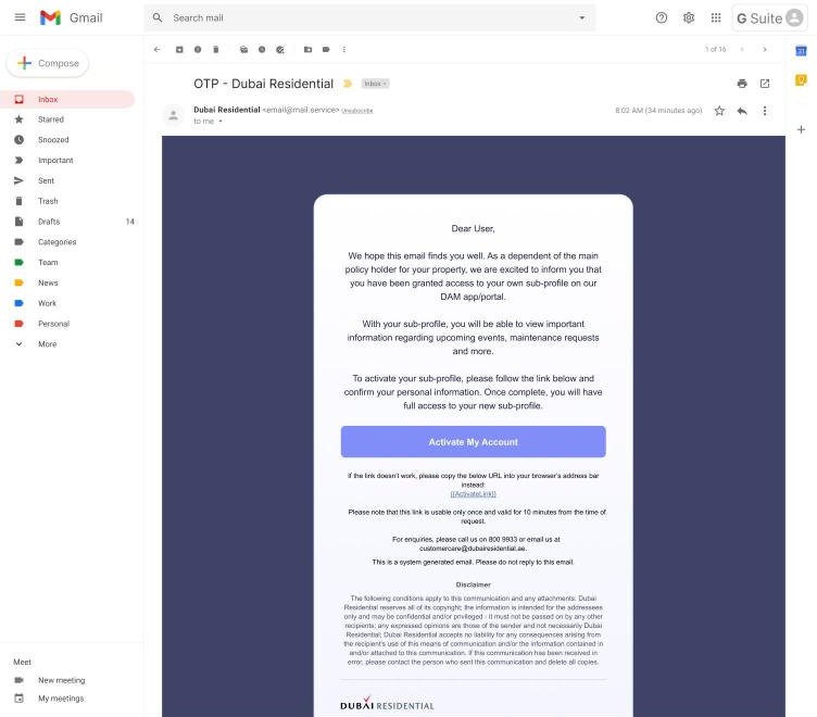
Account and status emails were designed alongside the screens, such as this invitation for a dependant to activate their own sub-profile.
Outcome & learnings
The renewal journeys were approved by the client and handed over with web, app and store designs. Mapping the scenarios first meant edge cases were designed, not discovered in build.
The hard part of a service app isn't any single screen. It's keeping one journey predictable while the rules underneath it change from tenant to tenant.
ADDED →
ADDED
A government website that had grown page by page. We started with the people using it, fixed the structure, then designed the pages.
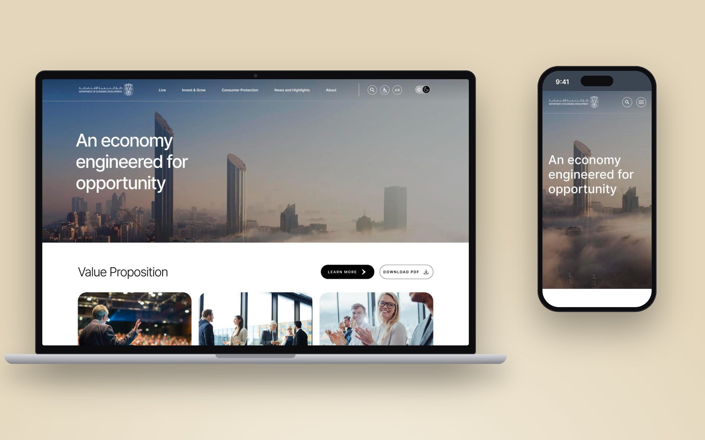
Structure before style
Many audiences, years of added content and no clear route to a task. A visual refresh alone would have kept the same problems.
People to pages
I worked on personas and journeys, the content audit, gap analysis, updated IA, wireframes and the module library, iterating with stakeholders and developers.
Research to handoff
- 5 segment personas & journeys
- Audit & gap analysis
- Updated IA & audience selector
- Sized modules & dev handoff
Release 1
A documented module library and component handoff prepared for the first release.
Five audiences, five different questions
Investors, founders, large enterprises and consumers all land on the same site with very different goals. Each persona captures one driver need, which later shaped the IA and the audience selector.
Maya: setting up from the UK
Maya runs a small UK business and wants to set up in Abu Dhabi without relocating. Mapping her steps showed where the site had to build confidence, from first click to applying.
Two weeks from audit to new IA
We reviewed the live site and its latest content, wireframed the existing pages to see them plainly, ran a gap analysis, then updated the information architecture.
Inventory every page
Each existing page was wireframed in low fidelity so content, not styling, was what we reviewed.
Compare with what people need
Pages were checked against persona needs and the latest content, marking what was missing, duplicated or misplaced.
Restructure, then design
Findings fed the updated IA and a block-by-block content map for every page before any visual design.
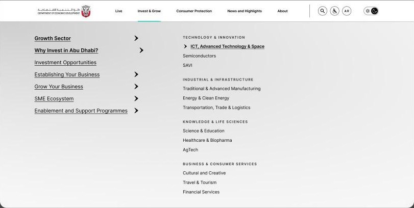
Five clear areas from one homepage
The updated IA groups content by what people come to do. Persona journeys like Maya's now follow a direct path: megamenu → SME Ecosystem → Business Setup → Virtual Licence.
From structure to interface
Map content before drawing pages
For each page I listed every block in order and placed that map beside a wireframe. Stakeholders could check content and structure in one view, and developers saw block order, not just visuals.
- Content gaps surfaced before design time was spent
- The same block names carried into the module library
- Hero bannerCareers heading, paragraph, image
- BreadcrumbHome › About › Careers
- Content blockOverview
- Floating buttonsApply for a job · internship
- Accordion setWorking at ADDED
- CardsGrow with us · Apply now
- BannerBuild your career CTA
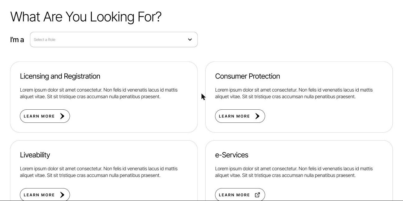
Let people say who they are
The personas showed that visitors arrive with very different tasks. An "I'm a…" audience selector on the homepage filters the most relevant services first, so nobody has to learn the department's structure to find their task.
- Default and role-selected states designed
- Same component on desktop and mobile
Sized modules, not one-off pages
Every page was assembled from modules grouped by size, each with variants and documentation for development. New pages could be built without new design work.
Page sections
Large, content-led blocks
Functional
Interactive, task-led blocks
Details
Small, reusable pieces
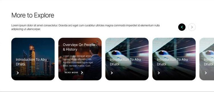
Licensing and Registration
Service card with description and link.
Learn more ›Pages built from the system
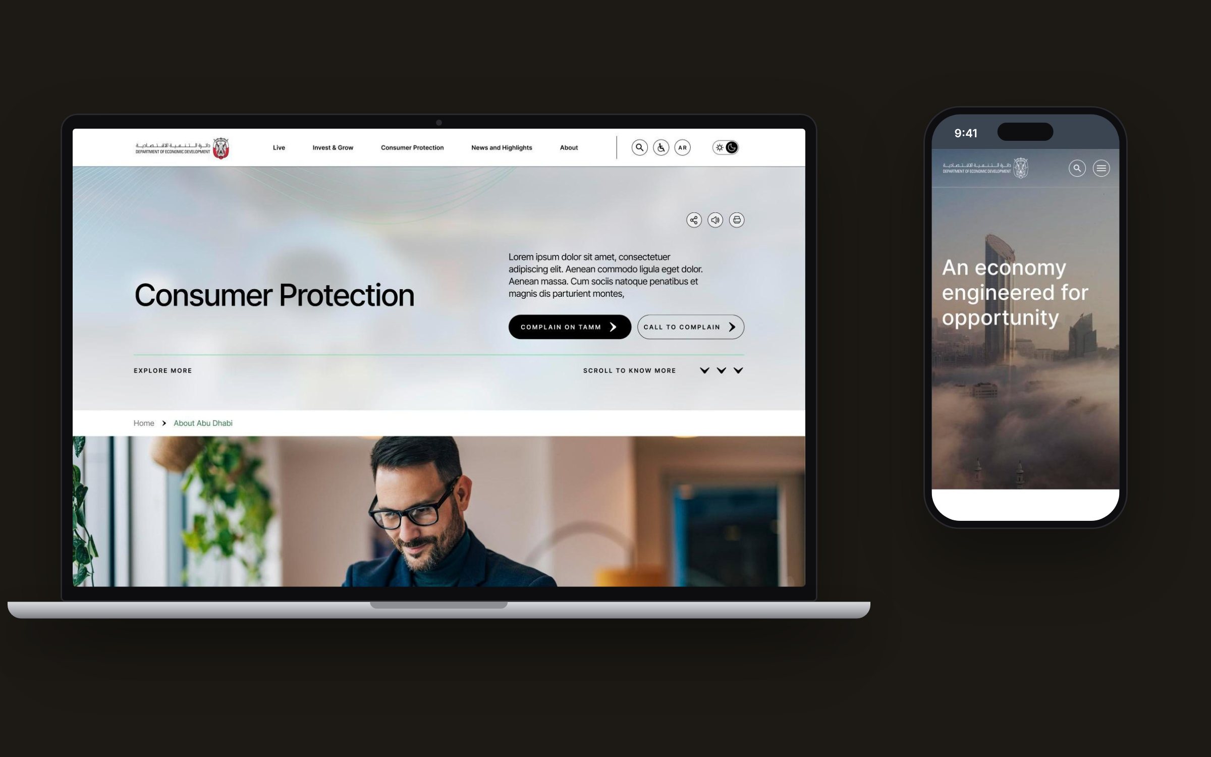
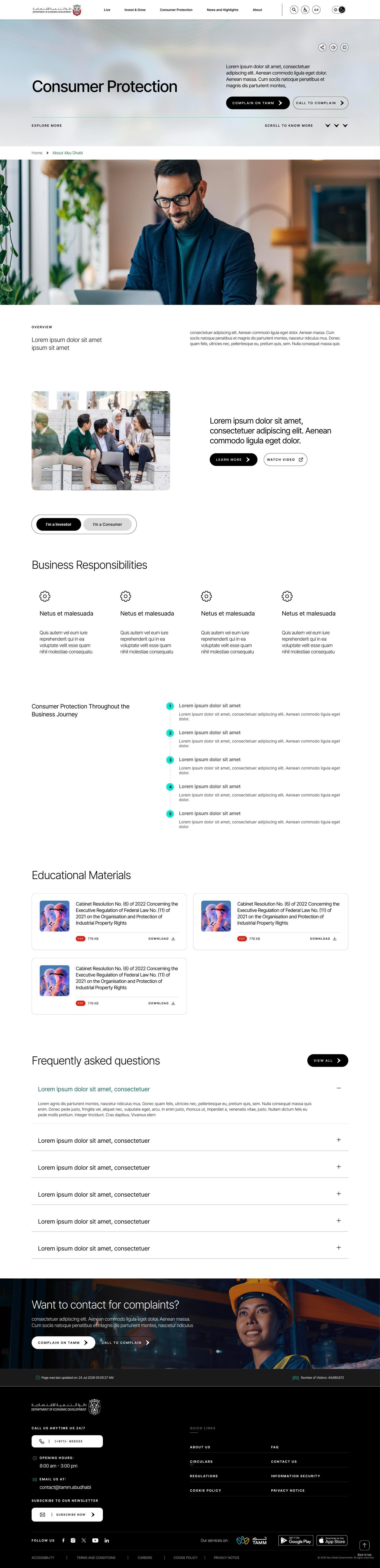
The homepage and section pages bring the structure together. Consumer Protection, shown in full below, combines a hero with clear actions, an investor/consumer switch, a step-by-step journey, downloads and FAQs, all from the module library.
Outcome & learnings
The project delivered personas and journeys, an updated IA, page content maps and a sized module library with developer handoff for Release 1.
On content-heavy public sites, the best UI decision is often an IA decision. Starting from people and agreeing the structure early made every later page faster to design and easier to build.
Invest Bank →
Invest Bank
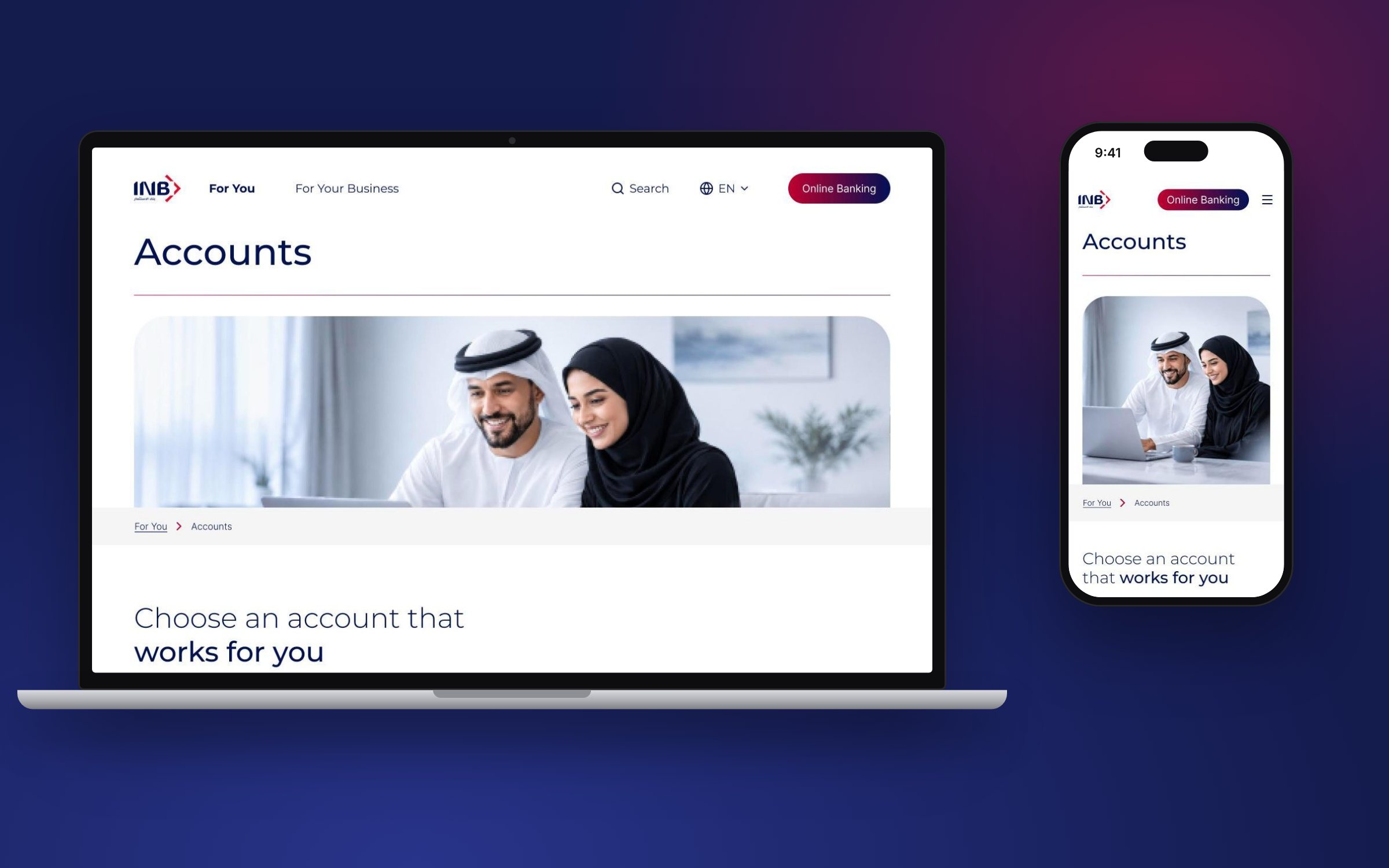
A UAE bank's website, rebuilt around who is visiting: personal customers, businesses and corporates.
Many audiences, one site
Retail, business and corporate customers each needed a clear way in, without wading through one long product list.
Research to build
I led research, analysis, team interviews and IA, designed wireframes and high-fidelity flows to WCAG guidelines, and supported developers through the build.
Strategy to system
- Benchmarking & key changes
- Sitemap, phase 1 & 2
- Navigation & product pages
- Grid, templates & docs
A template system
An approved IA proposal and a documented page system built in Sitecore.
Banking is no longer just functional
We looked at digital-first banks to see how they turn banking into part of everyday life: minimal design, a relatable tone of voice and mobile-first experiences. Those lessons set the direction for the proposal.
Monzo
Banking presented as part of everyday life, with a relatable tone of voice.
Revolut
Minimalist, mobile-first design that keeps each message simple.
Wio
Banking as an extension of both lifestyle and business identity.
1 · IA & content guidance
Segmented pages guiding users from inspiration to decision-making.
2 · Revised homepage strategy
Segment-led landing and detail pages, with a clear toggle between personal and business.
3 · Tone of voice
Tailored tone for each segment to match user intent and mindset.
Proposed sitemap, phase 1
Built from stakeholder goals, research insights and benchmark evaluations. The flows are practical, not conceptual: they show how customers will reach, compare and use products in the MVP.
A homepage that sorts people quickly
The homepage introduces the bank, lets visitors pick their segment and puts everyday tools up front, while account opening and applications move into secondary navigation.
- Campaign-driven hero banner with rotating promotions
- Segment-based entry point, filtered by user type
- Quick-access tools: loan calculator and FX rates
- Account opening and applications moved to secondary navigation
- "About us" preview with a clear call to action
- Support access bar with live chat
- FAQs and quick links as navigation support
From emotive to functional
Every page section has a job. We defined four content purposes so writers and designers knew what each block should make the customer feel or do.
Emotion
I can see that Invest Bank understands my way of life.
Lifestyle content and an emotive tone.
Inform
I can see the facts and unique selling points.
Product and account information with supporting imagery.
Engage
I'm ready to make a decision.
A single message, a clear call to action, simple visuals.
Navigate
I can move around the site easily.
Quick links, cards and CTAs.
Structure in the interface
Two front doors
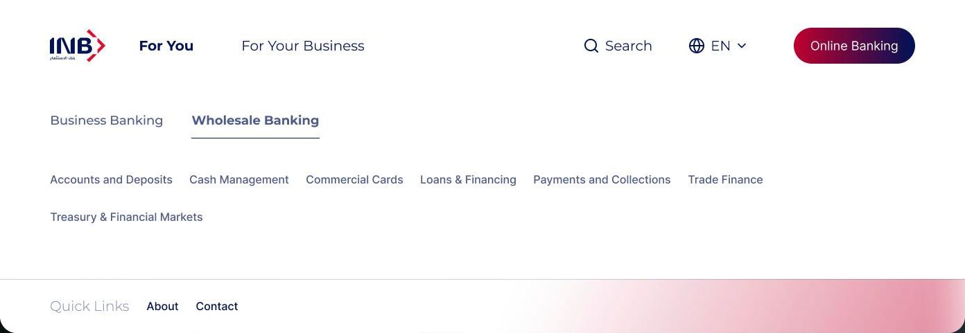
The top level splits by audience: For You and For Your Business. Inside business, a second tier separates Business and Wholesale banking before any product appears.
- Customers only see products meant for them
- Online Banking and Search stay one click away
Product pages that scan
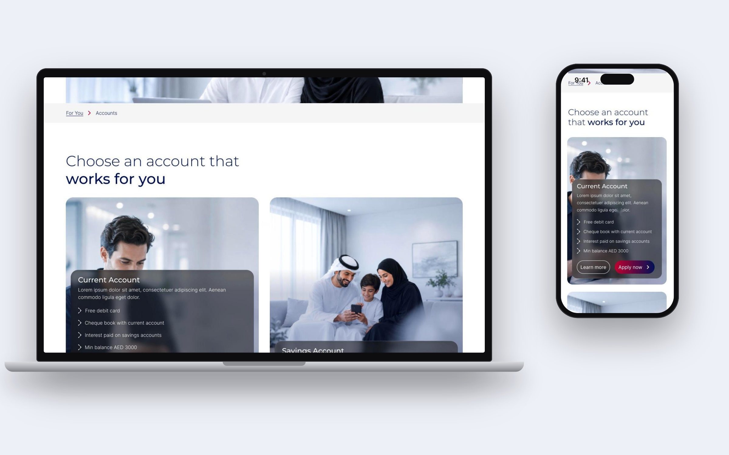
Each product page opens with a clear title and breadcrumb, then compares options as cards: key benefits up front, with Learn more and Apply now side by side. Supporting documents sit in tabs below.
- Breadcrumbs keep the audience context visible
- One card pattern reused across products
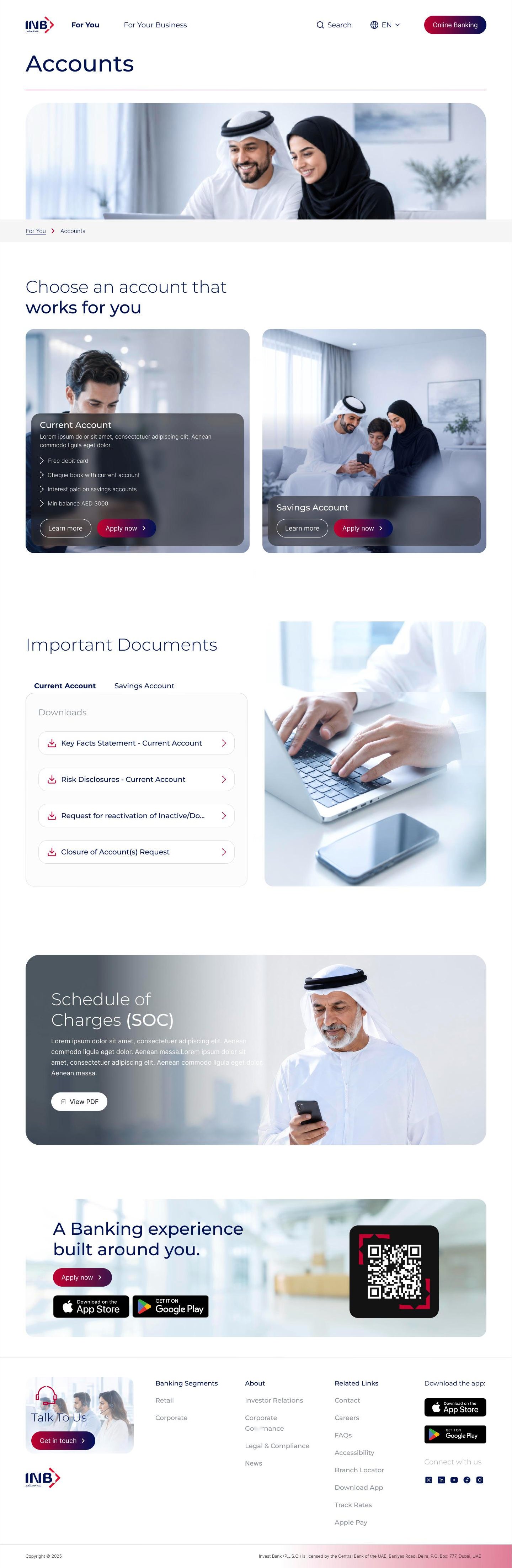

Rules the build team could trust
Alongside the page templates, I documented the grid, type, colour, form fields, buttons and interactive widgets, so new pages fit the system in Sitecore without new design.
Content container max 1296px, centred. Wide screens cap content at 1776px.
- Free debit card
- Cheque book
Designed to WCAG guidelines, with font resize, high contrast and keyboard navigation planned in the IA.
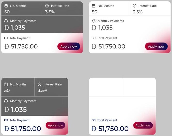
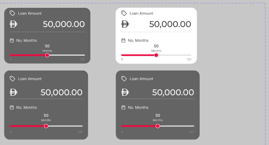
Scaling into self-service
After the MVP, phase 2 gives every product its own page and adds tools that help customers plan, compare and act without needing human support.
Tools hub
- Loan calculator
- Eligibility checker
- FX converter
Branch & ATM locator
- Filter by branch, ATM, smart deposit
- Search by area or emirate
Master search
- Predictive, tag-filtered results
- Recent and popular searches
- Spelling correction
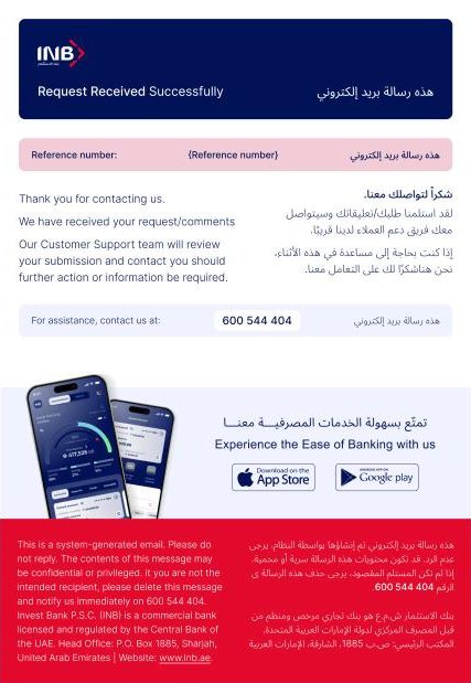
Bilingual service emails
Confirmation emails follow the same system: English and Arabic side by side, a clear reference number, the support line and an app download banner.
Outcome & learnings
The IA proposal moved from phase 1 to a full-scope phase 2 sitemap, and the page templates and documentation supported the team through the Sitecore build.
In banking, navigation is the product until someone signs in. Structuring by audience first made every later decision, from menus to templates, simpler to agree.
Unimad →
Unimad
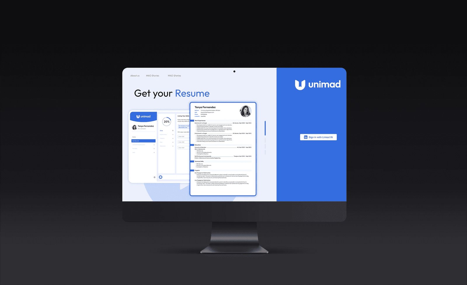
How might we help international students attract job opportunities by building powerful, unignorable personal stories?
Skilled but unseen
Visa limits, low visibility and no structured guidance left international students struggling to stand out to recruiters.
End to end
As Product Designer I designed user flows, wireframes and high-fidelity prototypes, refined with the team and user feedback.
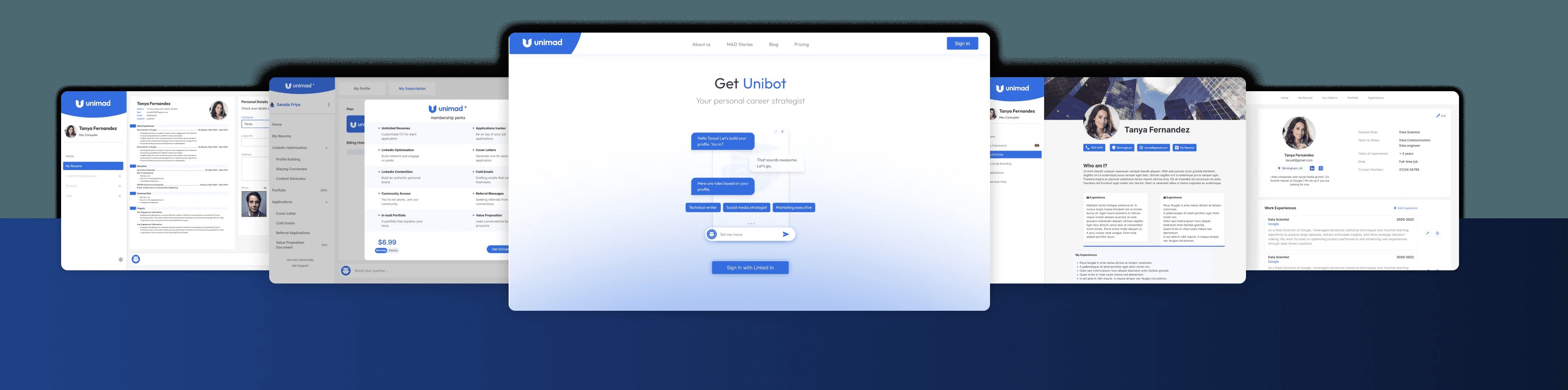
Unibot-guided tools
- Profile & resume builder
- Portfolio builder
- Content creator
- Unibot AI assistant
Locked steps hurt
Users stalled on locked profile sections, so we removed the locks and moved key tasks into onboarding.
Listening to students first
Interviews with international students uncovered limited personal branding, a lack of tailored career strategies and weak professional storytelling. These insights shaped Unimad: one platform, powered by Unibot, that makes users unignorable to recruiters.
Limited personal branding
Students had skills but no way to present them as a story.
No tailored strategy
Generic career advice didn't fit visa and market realities.
Weak storytelling
Profiles listed tasks rather than impact.
Four tools, one assistant
Unibot acts as a 24/7 assistant across every tool, giving personalised recommendations, real-time corrections and motivation.
Profile builder
Standout resumes and optimised LinkedIn profiles with AI guidance.
Portfolio builder
Shows achievements visually, with templates by industry.
Content creator
Helps craft posts that strengthen a personal brand.
Unibot AI
Conversational feedback for profile optimisation and storytelling.
From step-by-step wireframes to a visual system
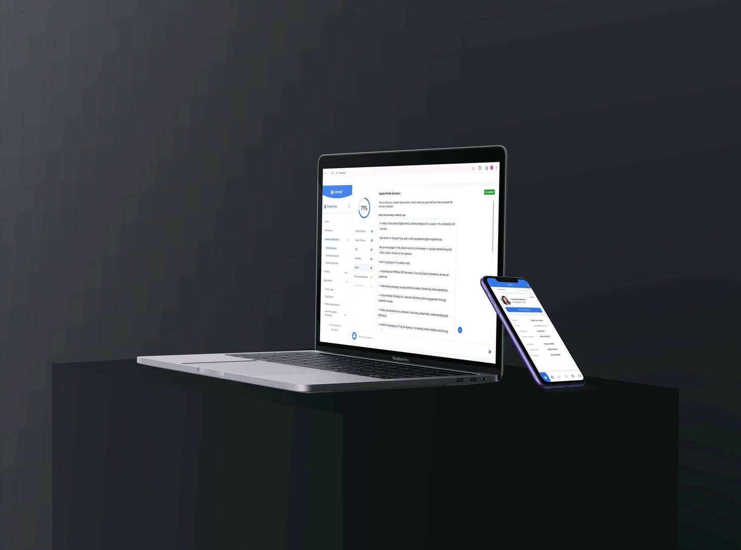
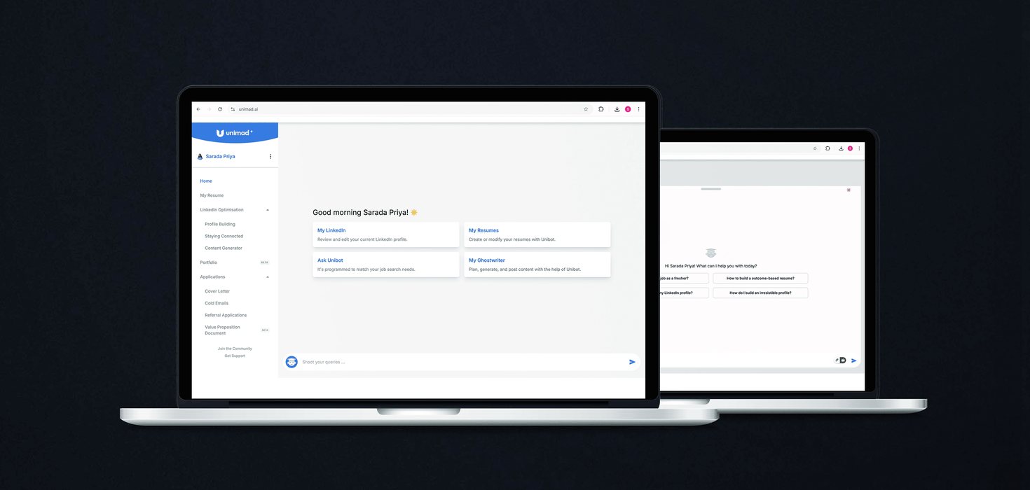
Wireframes focused on clear navigation and a step-by-step approach. High-fidelity prototypes simulated Unibot's guidance inside the Profile and Portfolio builders.
Wireframing & prototyping
Interactive prototypes showed real-time Unibot feedback while students worked.
Visual design
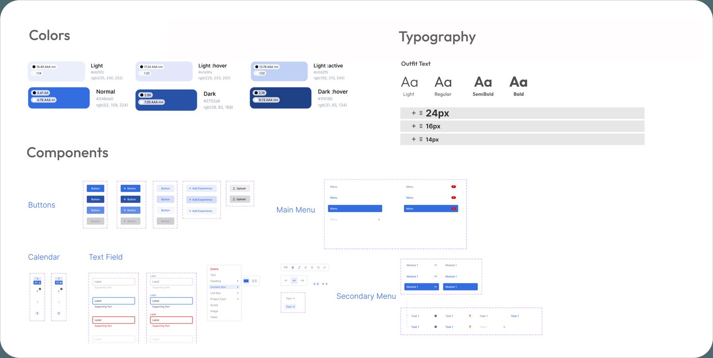
Purple for confidence, blue for trust, and clean, readable type.
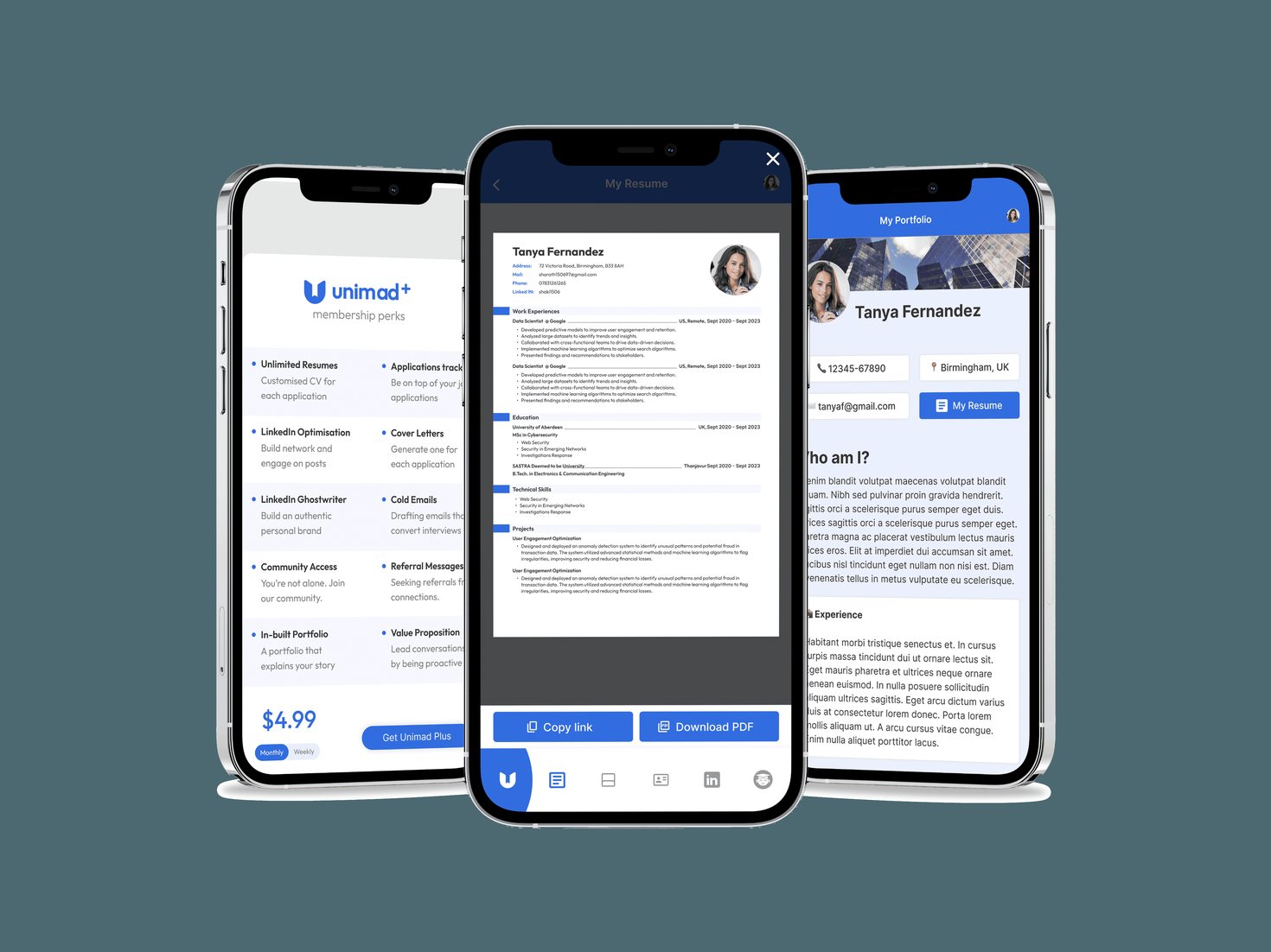
Multi-platform
Flexible layouts that respond to screen size and orientation.
Removing the locks
Usability testing with international students showed the need for smoother onboarding and more visual examples.
Locked sections stalled progress
Users struggled to complete every step of profile optimisation because sections were locked, which cut engagement.
- Removed the lock on each profile section
- Moved key profile tasks into onboarding
- Added instant Unibot feedback at every stage
What I learned
Technology can break real barriers. Combining AI tools with human-centred design helped students succeed and built a sense of community, and it reinforced how much iterative feedback matters.
Crunch →
Crunch
How can we simplify nutrition tracking for busy young professionals while keeping them engaged?
Tracking fatigue
Young professionals struggle to track intake, forget hydration and balanced meals, and lose motivation over time.
Single-purpose apps
Existing apps focus on one thing, like calories, without simplicity, personalisation or motivation.
Easy, personal, social
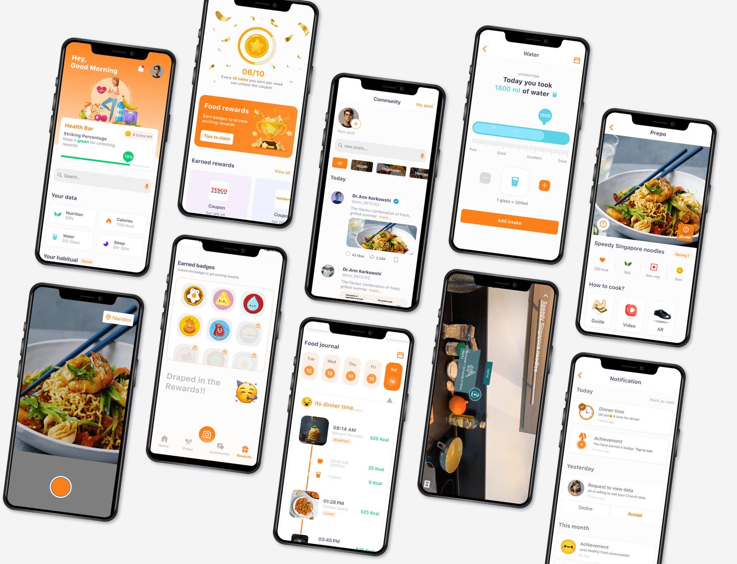
- Barcode meal scanner
- Tailored reminders
- Gamified rewards
- Community features
Research to testing
Interviews, surveys, personas and storyboards, then wireframes, prototypes and usability testing.
What 18–35 year olds told us
User interviews and surveys with 18 to 35 year olds, plus competitor analysis. 80% of users prioritised simple tracking features like barcode scanning, and social and gamified elements were motivating.
think it's important to eat a healthy diet
assume they already eat healthily
want to change their diet plan
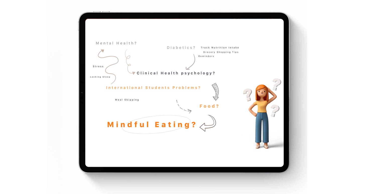
Personas and a before-and-after storyboard
Personas captured target users' goals and frustrations. A storyboard compared today's fragmented tracking with the experience Crunch should create.
Frustrating and generic
Complex apps with little personalisation make tracking feel like a chore.
Easy and tailored
Barcode scanning and personal reminders make tracking quick enough to keep doing.
Essentials first, then interaction
Low-fidelity wireframes prioritised essential features: simple navigation for meals, hydration and sleep, plus space for progress sharing. Figma prototypes then tested the interactions.
Ease of use
A barcode meal scanner for quick tracking.
Personalisation
Notifications tailored to each user's preferences.
Engagement
Gamified rewards and community features.
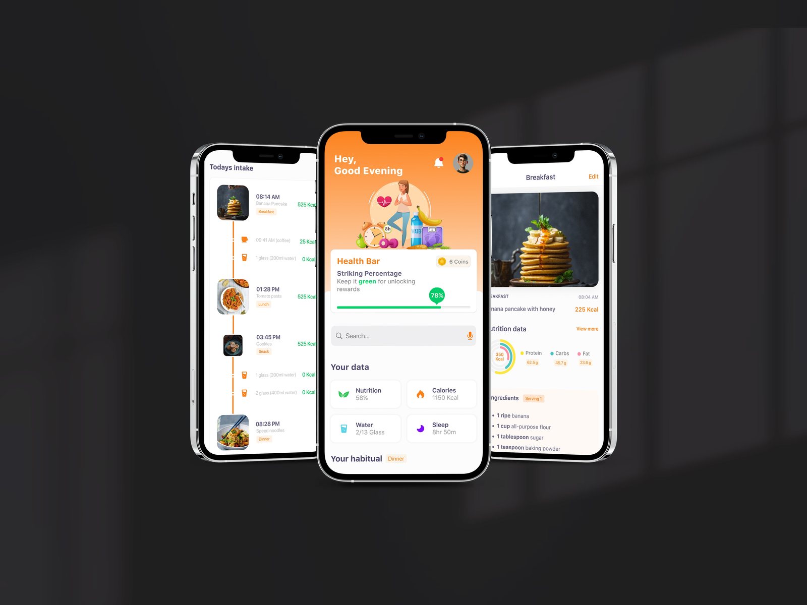
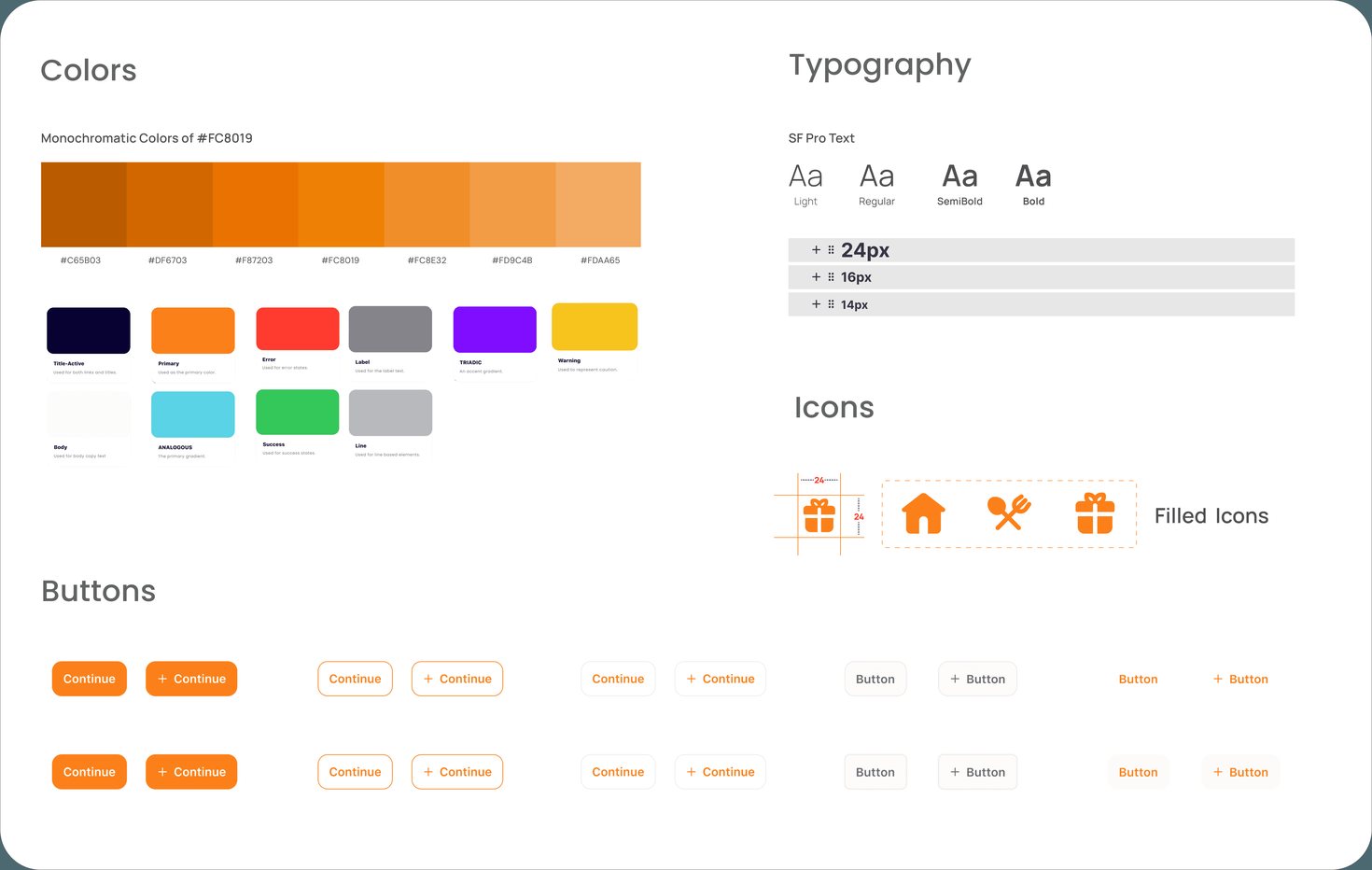
A warm, energetic visual identity
Vibrant colours, accessible typography and friendly iconography chosen for the app's target audience.
Fixing search and calorie tracking
Testing sessions with participants aged 18 to 35 evaluated usability and functionality.
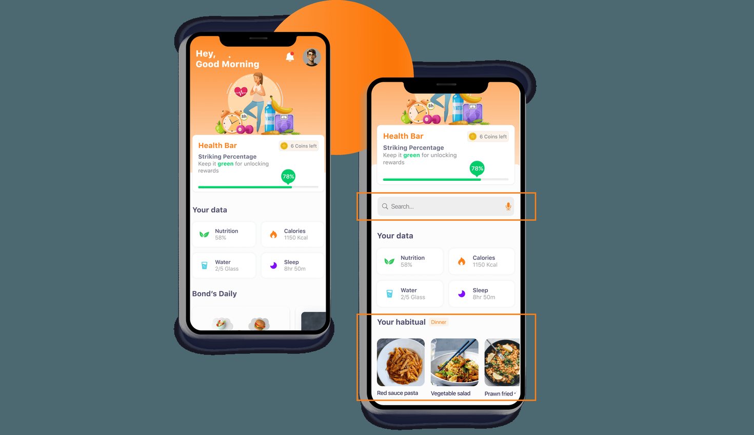
- The search bar was hard to find
- Calorie tracking felt unintuitive in the first design
- Simplified search placement using Hick's Law for better visibility
- Added frequently used foods to speed up calorie tracking
What I learned
This project was about balancing simplicity and motivation. I gained experience in gamification, iterative testing and turning feedback into an engaging product, while applying usability principles and UX laws.